Before and After Stories – The Isabella: A Partial Kitchen Remodel
Once the apple of our homeowner’s eyes, this Chaska, MN kitchen showed its age. Our clients had fallen out of love with the dated styling and sought a brighter refreshed kitchen environment in which to work and live. Because the bones of the space were solid, the Che Bella team completed a partial kitchen remodel and rekindled the spark between homeowner and kitchen – take a peek at how we did it!
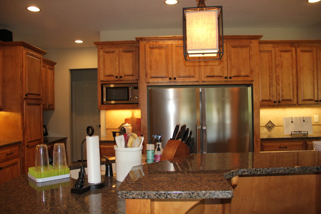
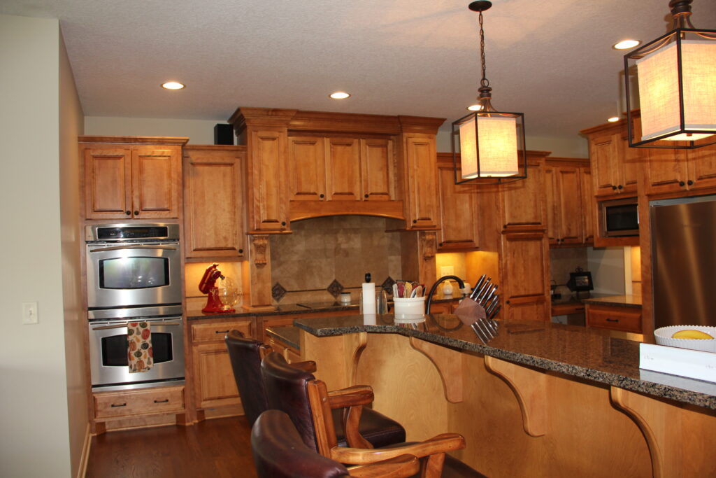
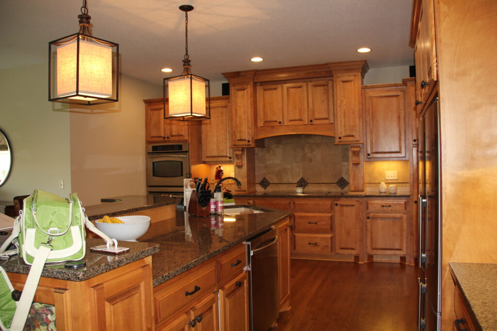
Tone-On-Tone Wood – The “Before”
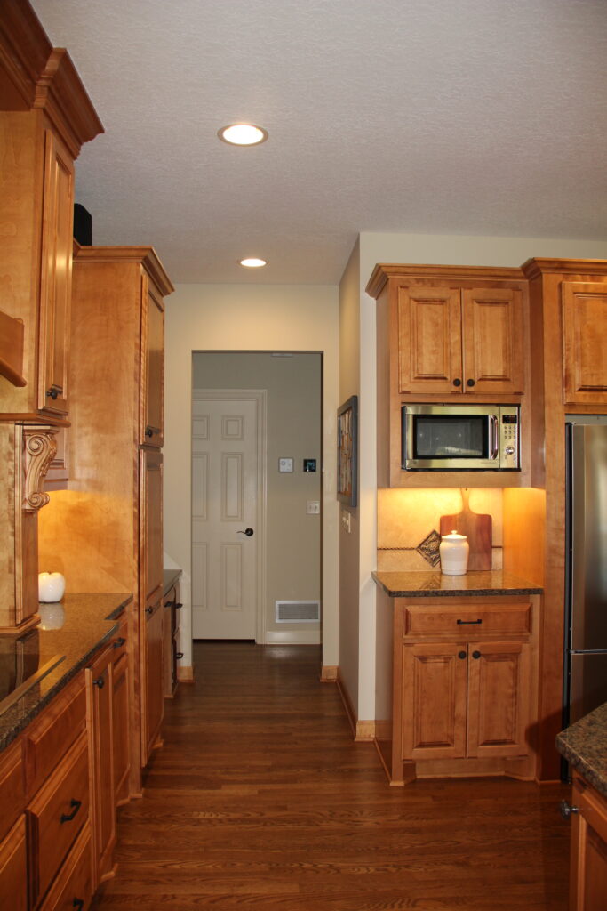
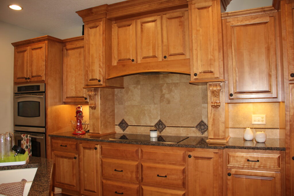
This kitchen emulated the design style of its day with warm tone-on-tone-stained cabinetry and flooring. In its original state, the monochromatic wood tones stretched from wall to wall and literally from floor to ceiling. A travertine tile backsplash behind the cooktop and above the dark granite countertops maintained the uniform feel nearly matching the wood tones. In addition, the scrolling detail on the woodwork no longer matched the style of the homeowners. It was time for a change.
The light fixtures in the space, while abundant, were dated stylistically and ineffective in lighting the kitchen. Additionally, the cabinets and countertops absorbed the light instead of allowing it to illuminate the space. A lighting solution was at the top of the list.
On the upside, the existing layout of the kitchen was workable; however, it needed a few enhancements to streamline its functionality. Enter Che Bella Interiors!
Light and Bright – The “After”
Knowing the footprint of the kitchen would stay intact, intentional design choices were made to heighten the transformation. Color selection of cabinetry, backsplash and counter materials played a huge part in the design plan. Lighting also received increased focus.
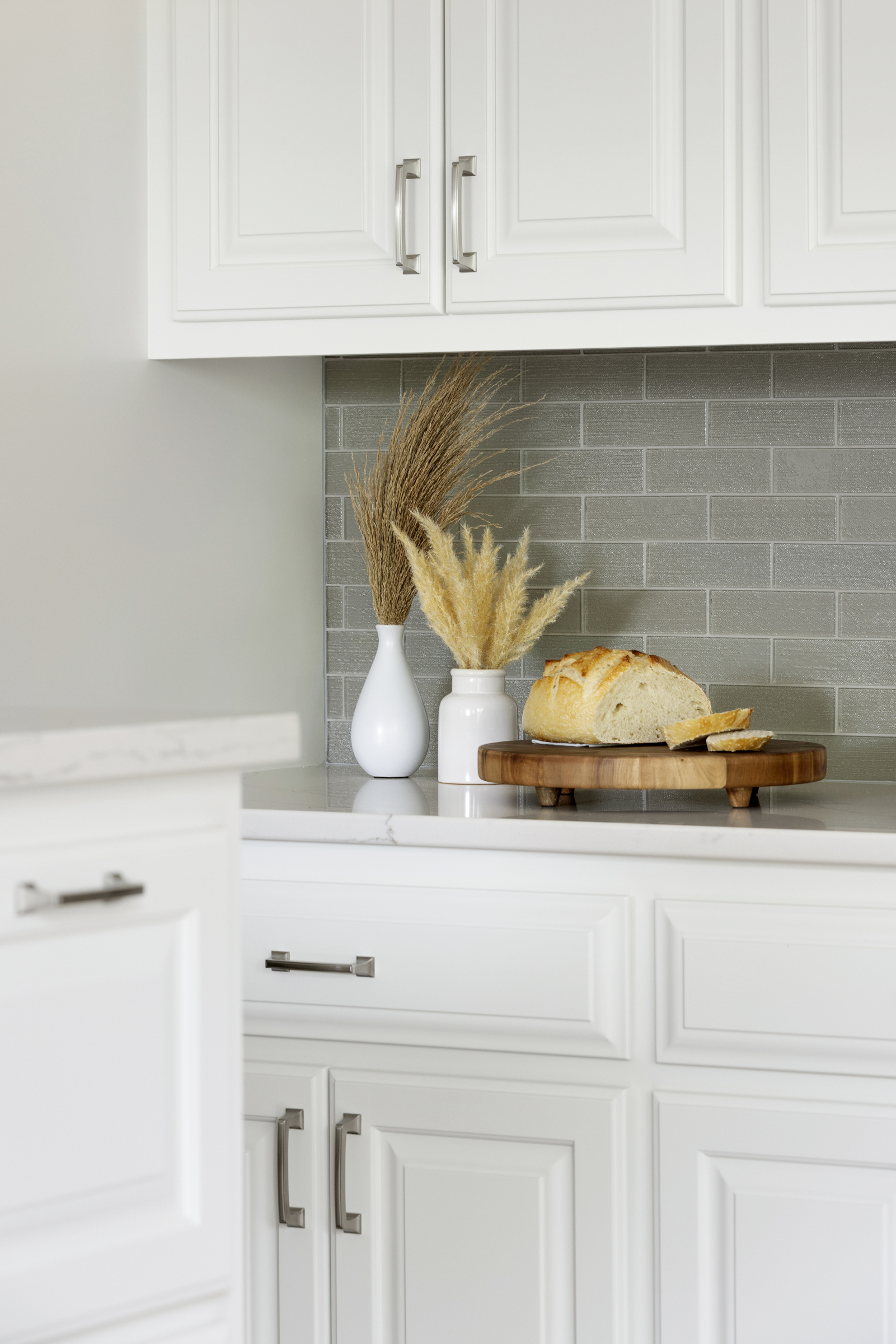
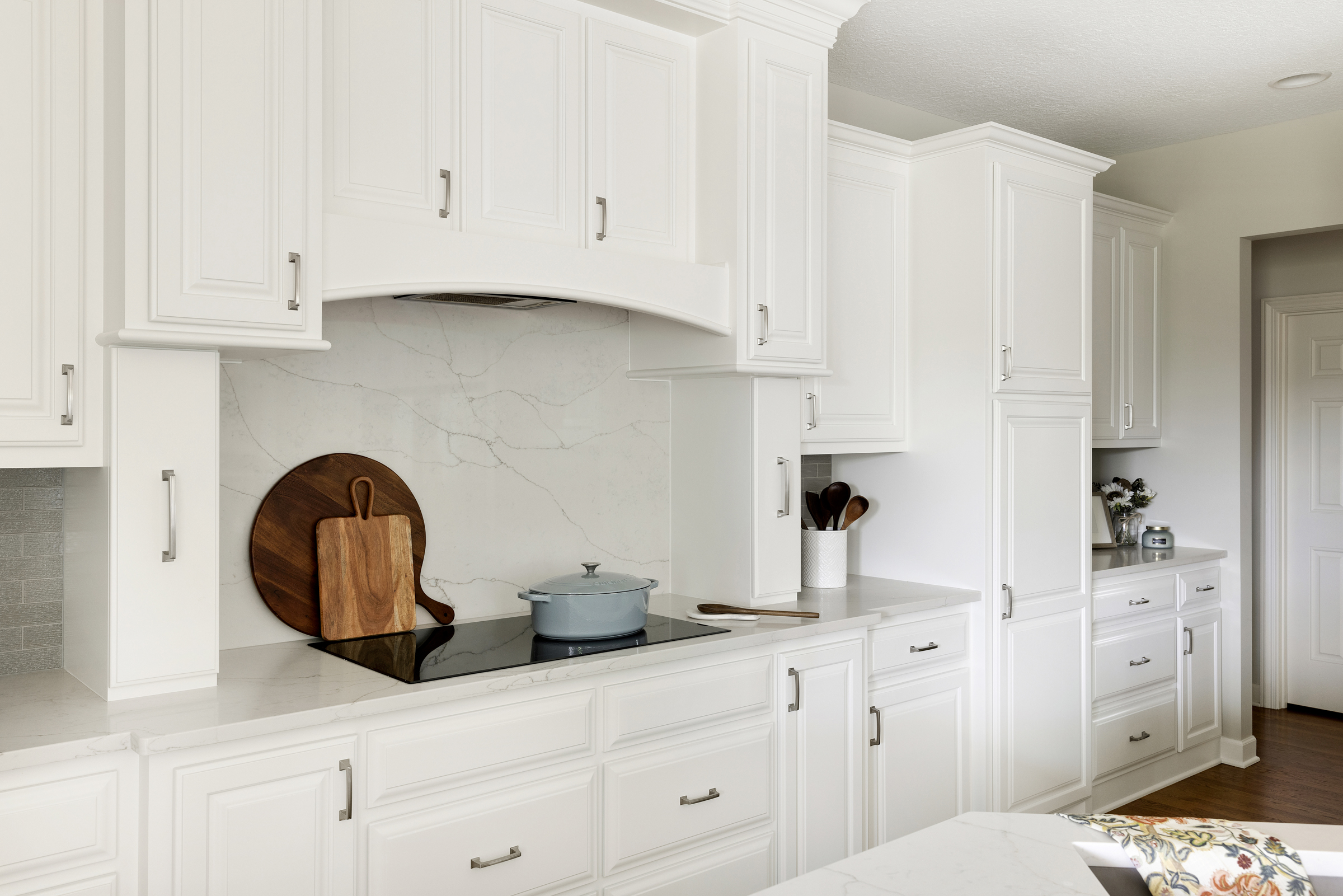
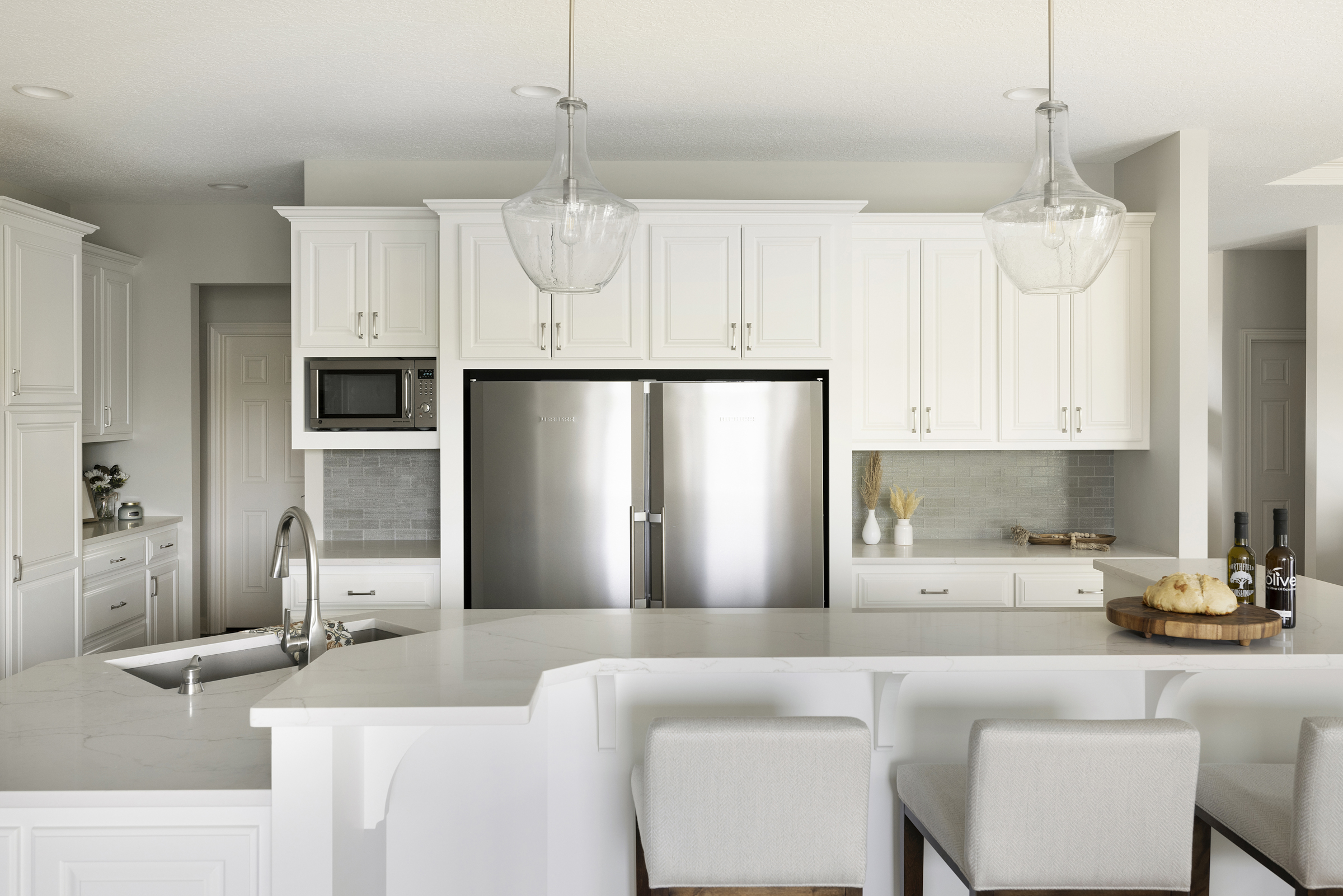
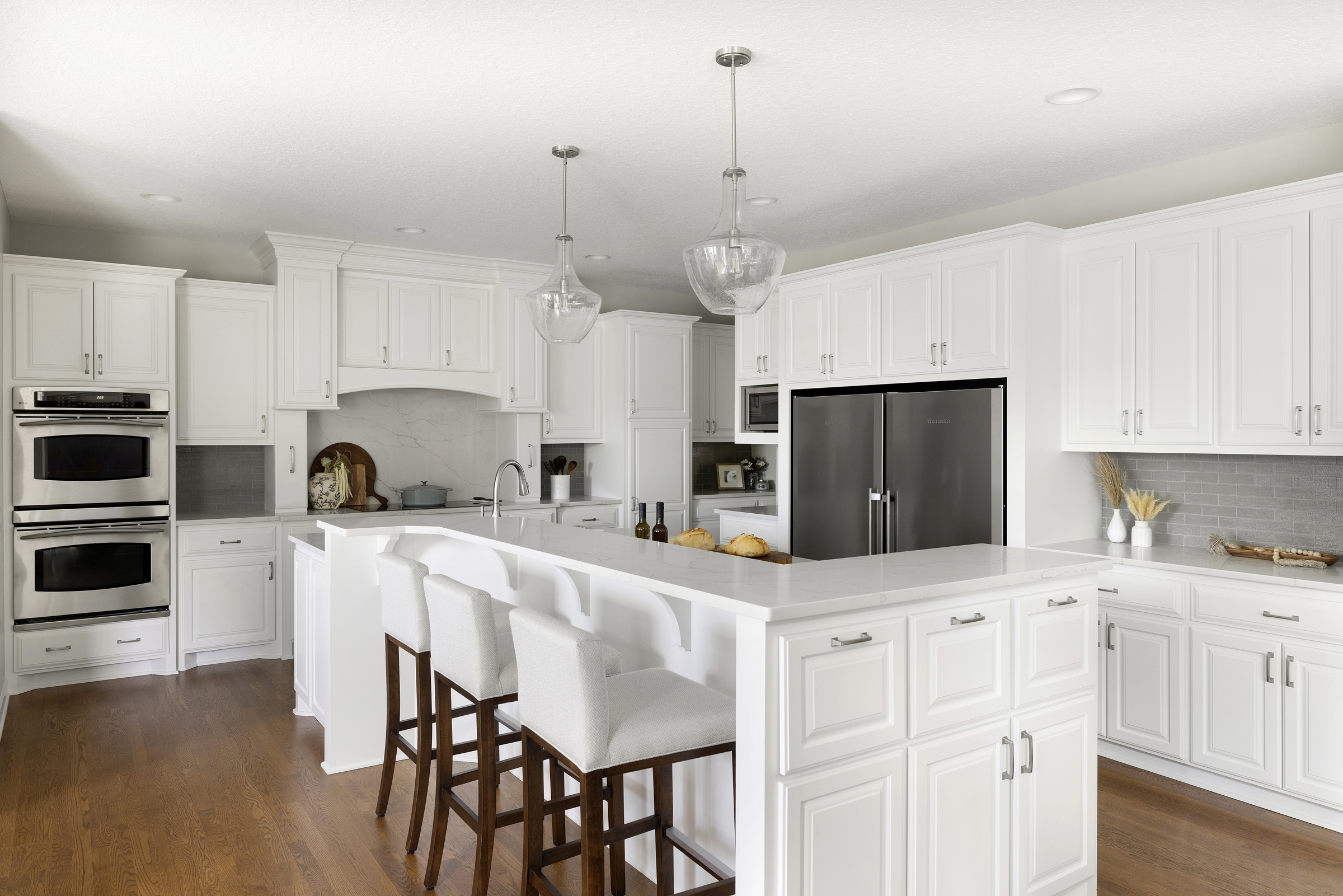
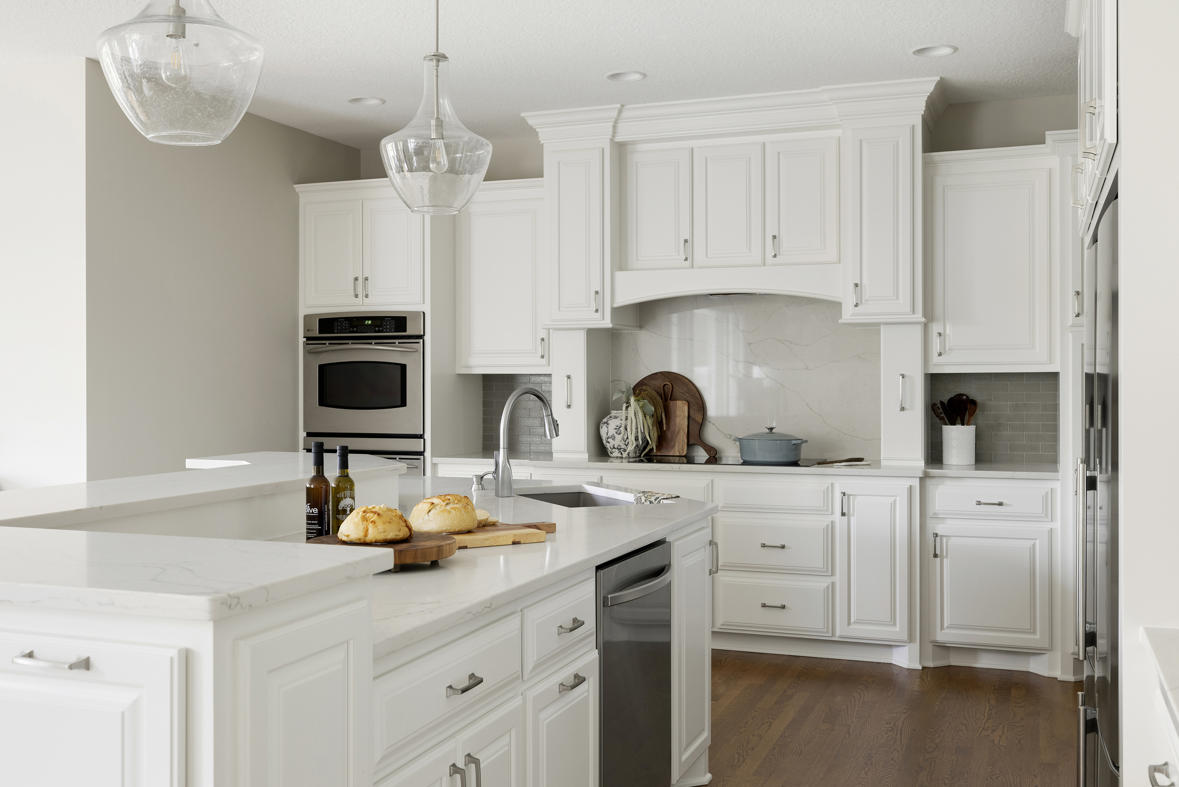
For this kitchen remodel project, it’s worth citing the cliché, “it’s amazing what a coat of paint can do!”. The brilliant off-white cabinetry sets the tone for the project. We played off the painted cabinetry in the adjoining dining and family room for a seamless flow into the kitchen. Painting the previously wood-toned cabinetry and adding new cabinet hardware adds high contrast against the warm-toned wood flooring that stayed in place and completely transforms the feel of the space. The scrolling detail on the original cabinetry is minimized and spice pullouts on either side of the cooktop replace decorative corbels for increased usability.
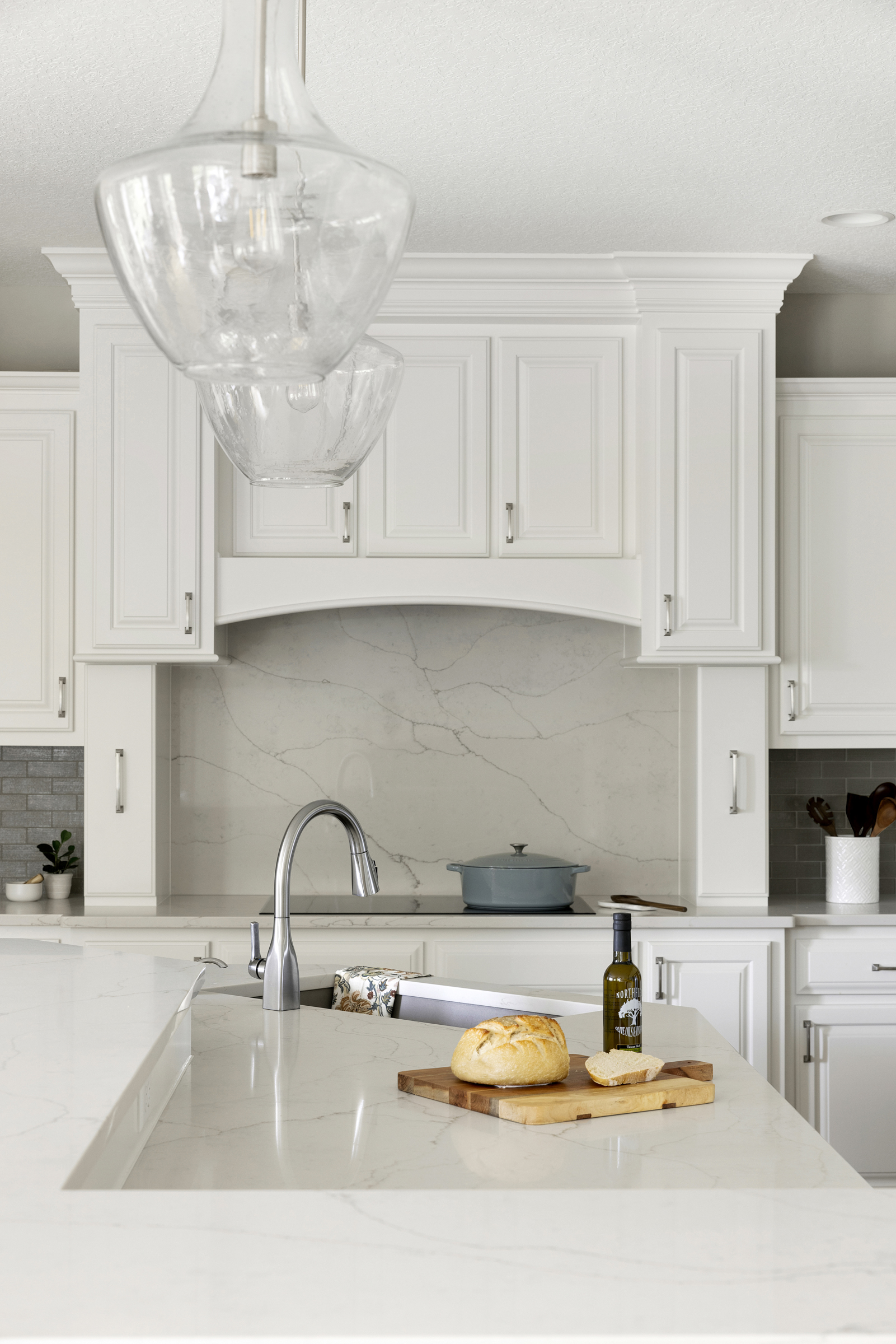
The island shape and tiered counters remain and are enhanced with dazzling white veined quartz countertops. The structure really works with updated materials in place. The back wall features the same quartz material in a striking vertical application as a full-height splash behind the cooktop. It sets apart from the warm gray glass linen subway tile backsplash throughout the rest of the kitchen. What a statement!
While the original footprint of the kitchen remains largely intact, new cabinetry replaces a rarely used desk area to eliminate a clutter-gathering zone and to add storage. Appliances remain in their original placement, and only the cooktop was replaced. Reusing the appliances was a priority.
Lighting is the pièce de résistance in this project. New seeded clear glass pendants with exposed bulbs hang over the island and take up limited visual space while existing recessed lights now house updated bulbs with greater output and a warm white color temperature. Lighting, in concert with design elements intended to brighten the space, make a successful combination.
With the transformation complete, this kitchen now exudes energy in a light, bright, up-to-date setting!
Transformation Complete!
This partial kitchen remodel demonstrates what can be done to refresh a space without taking it down to the studs or removing walls – especially when starting with a solid existing layout. Through imaginative design and a fresh mindset, we were able to breathe new life into this kitchen. If this before and after has your wheels turning, contact our Twin Cities remodeling team at Che Bella Interiors Design + Remodeling. Each day we strive to make your home beautifully yours!


