A Tale of Two Kitchens
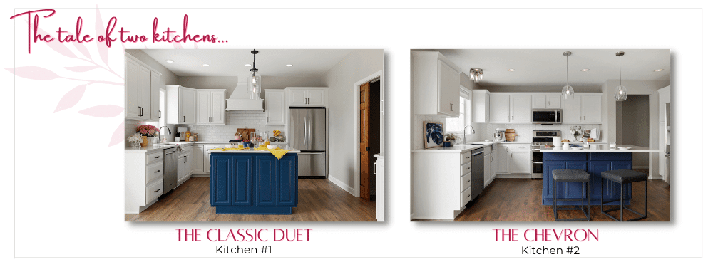
At first blush, these two kitchens feature similar design elements – an island of brilliant blue, topped with sparkling white quartz sits centerstage in each, surrounded by crisp white cabinets and a complementary white backsplash. A mid-toned floor lies underfoot. We acknowledge that they share similarities. We encourage you, however, to look a little closer to learn how intentional design choices and nuanced material selections impact the overall feel, providing a unique character to each space.
A seemingly rote design scheme can be turned on its head when the designer or homeowner makes just the right choice. The color, texture, and dimension of materials selected, along with the way in which they are presented, make all the difference in the world as you will soon learn in our comparison of each project! An interesting note is that both of these kitchen projects were partial remodels meaning we worked with existing cabinetry to refinish and update. This makes the wide differentiation between the two even more impressive. Read on to learn how the Che Bella design team set these two spaces apart!
📖
Chapter 1 – Island Color and Design
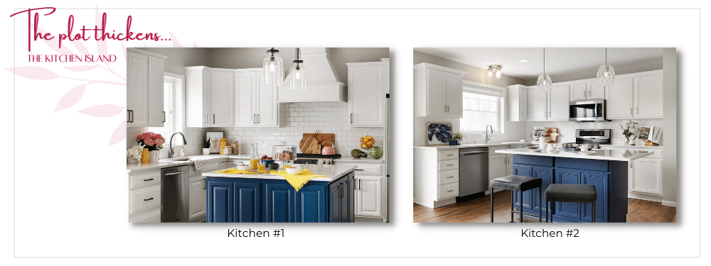
Let’s start with the bright blue elephant in the room – in this case, a gorgeous island dressed in blue grounds each kitchen. The hue of the paint chosen contributes to the differentiation. While subtle, the cobalt selection in kitchen #1 radiates energy, while the dustier slate blue in kitchen #2 emotes a more tranquil, restrained feel. Both colors are intentional in their selection.
The second point of separation exists in how the island was designed to be used in each space. The island in the first kitchen is designed for prep and storage – a straight-forward base with ample shelving and drawers with limited counter overhang. Meanwhile, the island in kitchen #2 was designed as a gathering space, with an overhang and seating added on two sides, in addition to the requested prep space and storage.
📖
Chapter 2 – Cabinetry and Hardware
Shifting our attention to the cabinetry, take note that cabinet color, layout and design in any project have a significant impact due to the amount of square footage it possesses! Recall that in both kitchens, we refinished existing cabinetry and worked it into the design.
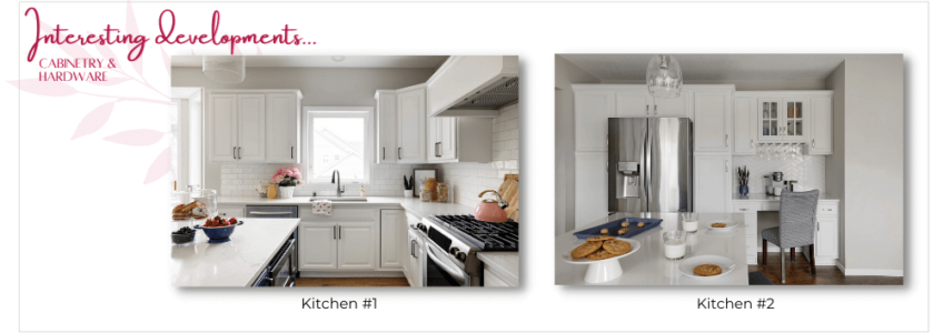
Kitchen #1 features a raised panel design for the doors and drawer fronts which conveys a traditional feel. The added detail on the vent hood pays homage to this style and the hood itself breaks up the linear visual of the upper cabinet installation.
The door and drawer front design in kitchen #2 is more contemporary in nature. The design, coupled with straight symmetrical lines of the upper cabinets, contributes to the clean modern feel.
Hardware and fixture selections add variation as well and are a vital tool for changing the overall feel of each design. While subtle differences exist, kitchen #1 adds finishing details with straighter lines, whereas those chosen for kitchen #2 have softer edges. These final elements both lean into each design, a final piece to the puzzle.

📖
Chapter 3 – Backsplash Detail
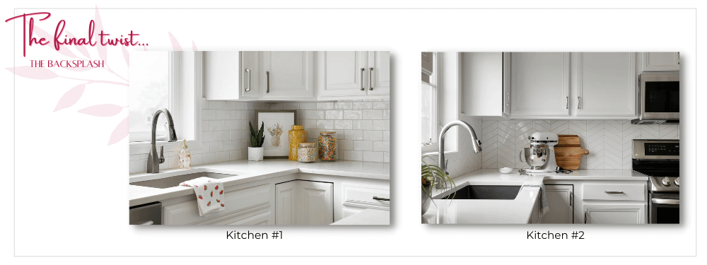
While the name ‘backsplash’ implies that this design element is intended to remain in the background, nothing could be further from the truth! The pièce de resistance when discussing the differentiation of these two kitchens is, indeed, the backsplash.
The timeless linear high-gloss white subway tile chosen in kitchen #1 offers the ideal backdrop for this traditional kitchen, while the second kitchen takes a more playful approach with a classic chevron backsplash, adding both interest and sophistication. This backsplash piques one’s interest without overpowering its surroundings.

The Final Chapter – Differentiate Your Space
The outcome of any design should never be thought of as coming down to one decision. Instead, it’s a collection of many intentional material and design selections, all guided by the intention to create a space uniquely matched to the style, taste and functional needs of a homeowner. Thank you for following along with our story. You can find both of these Shakopee, MN kitchen remodels in our kitchen remodel portfolio or by clicking here >> The Classic Duet and The Chevron.
Looking for more? Contact our Che Bella Interiors Design + Remodeling Burnsville, MN remodeling team of designers to discuss ways to differentiate the spaces within your home through smart, informed materials selection. We’ll work with you from concept to completion to create a home that is beautifully yours!


