Color Theory: Creating Mood Through Color

Today, we’re talking about color theory. Why? Because color theory and light have everything to do with invoking the right mood for any space. Color theory, encompassing a vast array of definitions, concepts, and design applications, begins with the Color Wheel as a starting point. But, truthfully, there is so much more than just the color wheel to consider! When trying to pick the perfect color, you also need to understand how the light plays into a room and how the lightness or darkness of a particular color effect the space as well.
One of the first things you need to ask yourself when looking for a color palette is, “What do I want this space to FEEL like?” This is why you see the color red being used in restaurants as it is said to be a warm, hunger-inducing color. This is also why you see shades of blue and beige in spas as they are a clear reminder of relaxing beachy vibes. Choosing the right color is instrumental in guiding the mood of a space. The next photo is a great example of this.
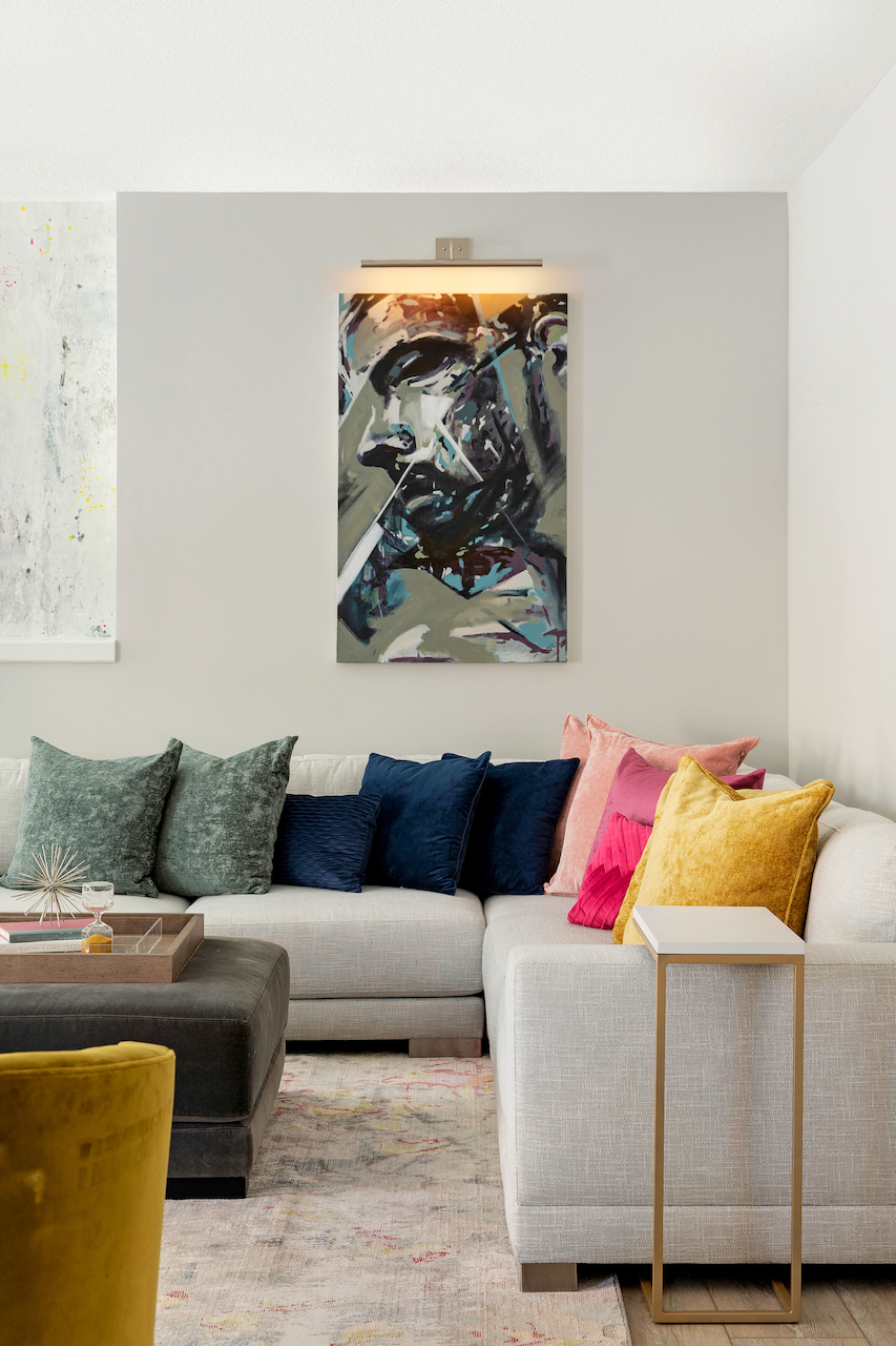
Che Bella Client Project 2020
The homeowners of the project above, which we recently completed, are avid local art collectors. When they see a painting, they know almost right away if they want it or not. However, even with the decision made to get it, they don’t always know where they’re going to put it! In sitting down with these clients, one of their biggest wishes was to create a space that could accommodate pieces collected over time across different color palettes. And here is where the element of ‘mood’ came in.
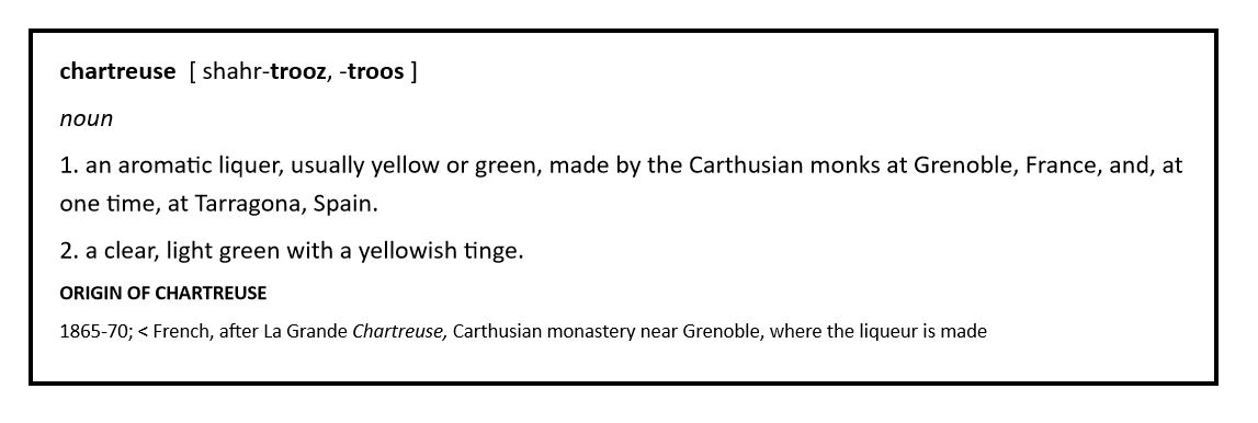
Working to evoke a neutral space didn’t mean they wanted the space to feel cold or museum-like. In fact, despite the need for a neutral space to display their range of art, they still wanted it to feel bright and lively for their growing family to enjoy together and with their friends. We worked with them to create an overall neutral space that would use the art, pillows, a rug, and a beautiful mural-type wallpaper with minimal pops of pink and yellow to sprinkle in pops of color. Our clients were also able to find beautiful, velvety deep chartreuse chairs to continue the ode to color in this bright space. Talk about color?! Just read the beautiful definition below! Now THAT’S a mood! Visit our portfolio to see more photos of this colorful space.
 *Dictionary.com
 *
*
COLOR PALETTES BY MOOD
Soothing Palette
To create a soothing color palette, it’s best to use the following types of colors to promote a restful mood.
- Pastel colors: Soft blues, soft pinks, soft greens
- Warm grays
- Creams & Warm whites
Think of the last time you were in a baby’s nursery, a spa or nail salon, or even a bridal boutique. We tend to feel relaxed in places like this because of the mood created by their surroundings. Want to see this color palette used in a space? Check out the Lighthearted project in our portfolio!
Fresh Palette
If you’re looking for a soothing palette but pastel colors are just not for you, try bringing in the following colors to boost that fresh, new spring/summer mood in your home. I know it’s been a while, but think of the last time you were in a modern office building or a gym or workout studio. Places like these look toward overall neutral tones with pops of color to invigorate interest and cohesive marketing. Check out the Bubbly project in our portfolio for more inspiration!
- Bright whites & Warm whites
- Cool grays & Warm grays
- Pops of Color: Pink, Orange, Yellow, Teal, Light Purple
Moody Palette
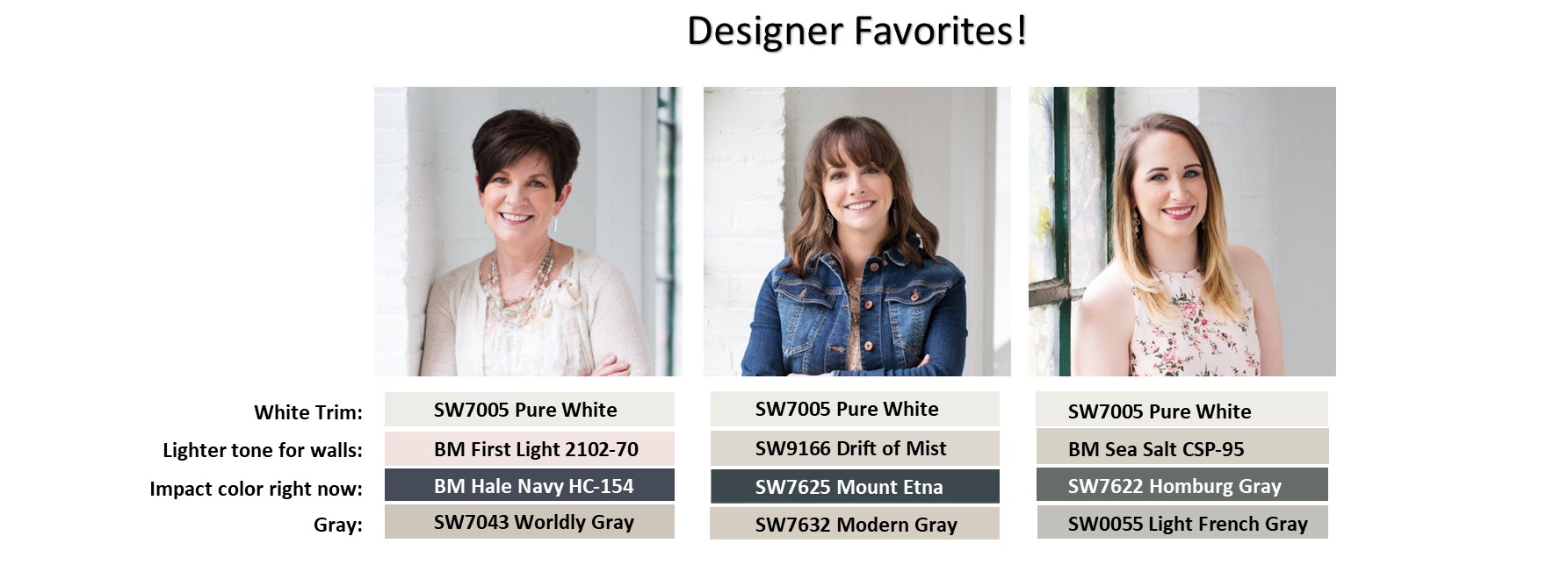
On the other end of the spectrum are the deeper tones, the dramatic jewel tones. If you’re really looking for a moody feel, these colors are the ones to look at. For myself, I’m prone to headaches so I prefer a space with a good mix of darker and lighter tones. One of the wall colors in my main living space is Sherwin Williams 7622 Homburg Gray. As you can see in our list of designer favorites below, tt’s my favorite impact color right now. These deeper tonal colors work well in bedrooms for people who work nights and have to sleep during that daytime as they invite a ready-to-snooze mood for a restful night. Check out the Luxe project in our portfolio to see how to use some of these tones!
- Burgundy or Garnet red
- Amber orange or Mustard yellow
- Emerald green
- Sapphire or Navy blue
- Royal purple
– PRO TIP –
 – PRO TIP –
If you just can’t find the right tone in a predetermined color swatch at the paint store,
request only a percentage of the formula be added to the paint can to create a lighter or darker version of the color you initially liked.
To go lighter, try 65%-75% of the formula.
To go darker, try 135%-145% of the formula.
Playful Palette
Kid’s bedrooms, playrooms, and daycare/schools are some of the best places to bring in a playful color palette to create that playful mood! The color wheel is the perfect place to start to find a great palette for these types of rooms. It starts with Primary colors, then Seconadry colors, and last, Tertiary colors [ tur-shee-er-ee ]. Adding any of these types of colors with a neutral is the perfect mix to keep those kids interested. This is why you see so many colorful kids’ toys! If you haven’t already, check out the Good Vibes project in our portfolio.
- Primary colors – Red, Yellow, Blue
- Secondary colors – Orange, Green, Purple
- Tertiary colors – Red-orange, Yellow-orange, Red-violet, Blue-violet, Blue-green, Yellow-green
- Colors of the Rainbow – Red, Orange, Yellow, Green, Blue, Indigo, Violet; a.k.a. ROY G. BIV
Neutral Palette
This palette is for the people who feel more at home without so much color surrounding them. Choosing a neutral palette for your space also invites the opportunity to change the mood of the space by introducing color with accessories that are easily changed out, like how we often do with the changing of seasons. Check out the Trendsetter project in our portfolio!
- Bright whites & Warm whites
- Cool grays & Warm grays
- Black or Charcoal
- Dark browns or Tans
- The ‘new’ neutral – Navy blue or Dark Gray
Minneapolis & St. Paul Home Interior Design Resource
Have you found your color mood from any of these ideas yet? There are so many brilliant ways to use the right colors to create the right mood for any space in your home. At Che Bella, all we need to know is what you want your space to FEEL like and we can take it from there! Some colors are customizable so your color mood is definitely out there somewhere. As we continue to keep our safe distances and our clean habits in this still very strange time in our world, let color help boost your mood whichever direction you crave. If you need to chat with one of our designers about the next steps on choosing your color mood, visit our new E-design ‘A Bit of Bella’ page for our offerings of virtual and over-the-phone services. We are also still working in our studio by appointment only. Contact us today to discuss your next project!
Written by Stefanie from the Che Bella Team