Concept to Completion: The Contemporary


CLIENT GOALS FOR THE KITCHEN
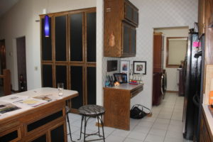
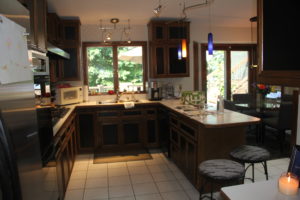
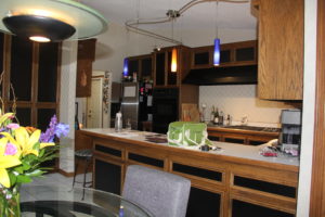
While other areas of this 1970’s home had been remodeled over time, the clients main level hadn’t been updated since they moved in. They were looking for better function and flow within their kitchen & adjoining mudroom/laundry space. When the home was filled with family or guests they would all congregate at the end of the peninsula in the walking path as well as inside the kitchen.
HOW WE ADDRESSED THEIR GOALS
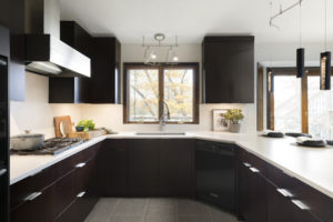
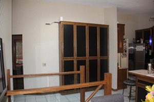
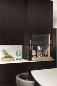
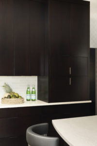
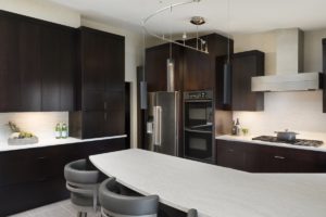
We adjusted the space plan of the Kitchen to allow for a designated seating space. We also removed the wing wall separating the desk and pantry cabinets to allow for more walking area in the main traffic path. We were able to add room for counter stool seating, larger appliances, and taller cabinets with better organization and a side counter area for snack and beverages to keep guests out of the kitchen in way of the cook. They also wanted a dedicated space for their favorite coffee machine and we placed that within a hidden compartment inside the Kitchen.
CLIENT GOALS FOR THE LAUNDRY/MUDROOM
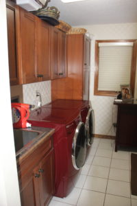
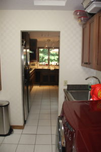
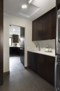
The mudroom/laundry room area services as the main entry for the clients and their family. It previously lacked flow as the front loading washer and dryer pushed into the doorway path and there wasn’t a space for folding and organization. This room is adjacent and visible from the Kitchen area as it shares a door as a point of entry for guests & family.
HOW WE ADDRESSED THEIR GOALS
We adjusted the space plan to allow for a stacking washer/dryer that pushed the deep machines out of the main walking path. This also allowed for increased countertop space and more storage for the clients.
CLIENT GOALS FOR THE POWDER ROOM
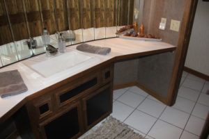
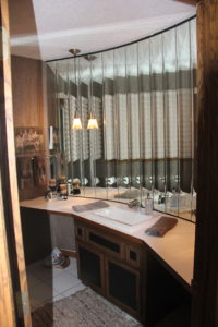
The clients main goal was to keep the wallpaper and reuse their sink & faucet. They were open to removing the mirrored panels as they had water damage along the bottom from sink use over time. Outside of those requirements they were looking for recommendations.
HOW WE ADDRESSED THEIR GOALS
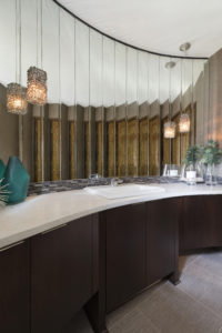
The powder room had great potential, but was dated in similar fashion to the other spaces. We were in love with the curved wall, beveled mirror panels, and large footprint. However, the countertop was angled, the cabinets were lacking, and the pendants were too dark. We replaced the cabinets and countertop with a curve to match the wall. A tile backsplash was placed over the bottom section of the beveled mirrors to hide the previous water damage and add additional protection.

- The footprint of the powder room as well as the drop in sink and faucet
- The client wanted to keep the wall covering in all areas and we worked around it to do so successfully
- Reused the range in the Kitchen
- We did not adjust any lighting locations due to the clients wishes and due to the ceiling style.
- The plumbing locations in the kitchen
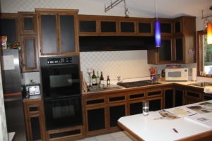

Tile flooring on the entire main level was removed and replaced with LVT to be softer and warmer on the foot
- The cabinets in all three locations: Cherry, Flat Panel, Full Overlay
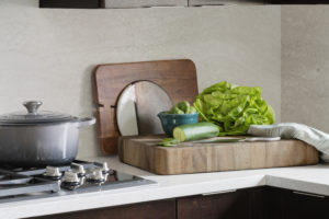
- Countertops in all three locations: Matte Cambria Ironsbridge
- Millwork replaced to break up the oak throughout
- Kitchen: Fridge (Kitchenaid), microwave, range hood (Vent-a-hood), dishwasher, sink, layout overall, lighting
- Laundry: Stackable washer/dryer allowed for more countertop space and flow into the kitchen.
- Powder: Matched the curve of the wall with the countertop and increased storage in the cabinets.



The clients are wonderful, collaborative, and appreciative – we loved working with them!

The countertops and full Cambria backsplash in the kitchen. We also loved how the cabinetry and new space plan have changed how the clients use their rooms day-to-day.


